 Looking through the eyes of an inspector, how clear is your website information?
I remember watching the crystal maze as a child. The obscure challenges set out by the presenter and the elaborate tight rope of a show where contestants would run, jump, crawl and swing across various challenges for the prize.
I tried this with a friend with disastrous effects! I got my head stuck in the bannisters, and on another such occasion fell down a large pit on a mistimed leap (don’t worry I am fine now).
I find a similarly complicated maze when navigate my way around some provider websites. Lots of information without a clear way through.
Inspector Scanning
As an inspector, if you have the time, before you even leave your desk to visit, you will be looking at information online. So how can we make sure your website reflects who you really are and what you really achieve in your service?
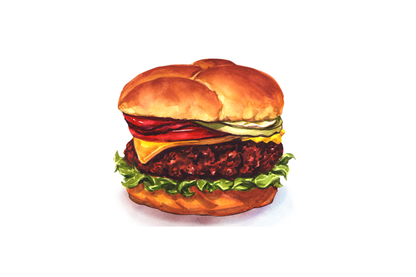
The Burger Analogy
So I heard a good analogy at school last week (we all know how much I love an analogy!). A process was described as a burger and I think it works quite well here!
For us the seed bun top has to be planning your information;
Who is your website meant for? This will help plan.
What facts do you need to put across?
Top tips: Use information from your statement of purpose to help plan some of your webpage.
Have a look at a similar service and critique what you think could have been done better – this will help yours.
If you start it – make sure it is relevant and up-to-date.
Burger (Veggie or otherwise) This should be the juicy bit! In other words, the Content
- Who you are
- Where you are
- The people you can support
- Your facilities
- Information about cost
- How to find you (Transport options – remembering people who need adapted transport too)
- Online Policies
The Garnish – So very important never to be missed
- You could consider Frequently asked questions sections. This shows inspectors you have listened to people who already use your service and the improvements/comments they have made.
- Text in different formats
- Easy read statements and pictures
- Quotes from people. There is nothing more powerful than a recommendation from someone using the service. Be sure to get consent and any permissions needed before you use it. People should also be aware of why you want the information before you start asking questions.
The Bottom Bun
Putting yourself in other people’s shoes. At times we need to do our best but the best thing to do is to get residents and family and other professionals to have a look at it as they will use it. This could be really fun if people can be supported to have a go, and shows again how you can be inclusive and interactive in your provision.
All this is important stuff and not only markets your business, but shows the inspector you are thinking of clients and their families in the way you design your information.
Challenge
So if you are already set up – Have a think about the people using your website. Are they leaping over boundaries and swinging from electric wires to locate who you are and what you do? How can you make it easier? And clearer?
Quality Compliance Systems
QCS are working hard to adapt policies and key information to make things clearer for people. We are right behind you in the pursuit of uncomplicated information!